Tag Archives: tutorial

Cherry Blossom Watercolor Tutorial

I’ve been really into watercolors and the versatility of them. However, I have very little skill in drawing, which makes watercoloring difficult…or so I thought. I recently started watching Art Impressions tutorials on Youtube where they use their watercolor stamps with water-based markers to stamp with. Then they go in with a waterbrush and just smudge out the lines to color in the structures. The end result is a gorgeous watercolor scenery that took minimal effort to make. They make it look so easy.

Unfortunately, I don’t have any Art Impressions stamp sets but I did pick up “Birch Land” stamp set from Altenew (one of my favorite brands!!!) on a previous haul. This stamp set features a beautiful tree with branch pieces and different sized arrays of leaves.

Birch Land Stamp Set - Altenew

The details in this stamp set is beautiful, the lines are super crisp and the stamp set was meant to be layered. I love the sentiments in this stamp set and how I can mix and match words to make a custom sentiment.

I used Tombow Dual Brush pens in the Landscape Palette to stamp the tree, branches and bird house. I also used Distress Inks to stamp the leaves.

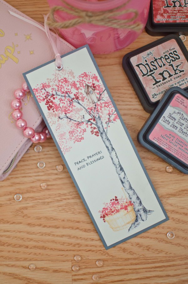
And this is what I came up with!

Cherry blossome bookmark (1 of 5)

I started with a long strip of water color paper that I had left over from another project.

For the tree and branches I used Tombow N25. Then taking a waterbrush (a wet watercolor brush will work fine too) I went over some of the inked parts on the tree and branches and started pulling some of the ink towards the centre of the tree to color it in. I made sure not to color the entire tree “grey” so that there are some dark spots and some light spots to add additional dimension. This part may need some practice as pulling too much ink inwards could blur the lines and lose detail in the work.

For the birdhouse I used Tombow 899. Again I used the waterbrush to color in the birdhouse.

The blossoms were stamped using a mix of Distress inks in work lipstick, tattered rose and fired brick. Layering these worked really well just keep in mind that if you’re unsure of where to begin, always start with the lightest color first. You can always stamp over it with a darker color later.

The basket was stamped in Distress Ink dried marigold. Then I stamped the same ink pad on an acrylic block and picked up some of the color with a damp brush and started coloring the basket in, leaving a bright/light spot in the middle to give the basket more dimension.

Finally, I finished the wet media part by stamping a sentiment.

Cherry blossome bookmark (4 of 5)

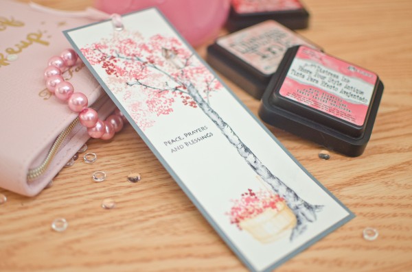
To finish everything off, I cut the top white space of water color paper off the top and adhered it onto a grey piece of cardstock. Then I added a silver eyelet at the top and strung some strands of pink ribbon through.

To preserve the watercolor and prevent it from fading and smearing, spray it with a light mist of cheap hairspray to seal everything. Learned this trick from my watercolor instructor when I still took art lessons.

Cherry blossome bookmark (3 of 5)

Hope you enjoyed this tutorial, let me know what you think in the comment box below. And let me know if you tried this or if you have any questions about what I did!


Tutorial – 3D light up marquee letters

If you’re just looking for the cutting file, the edited version of the letter “G” can be downloaded here

For tutorial, please see below!

Hello! It’s been some time since my last blog post! So much has happened and it’s been a whirlwind of activity. I finished my doctorate degree, moved across the continent to the east coast where I’ve set up my new home and started a post-doc fellowship. But I couldn’t leave without bringing with me my precious crafting supplies! I even packed my Silhouette Cameo in my luggage (I’d forgotten to pack it in the shipping cube…oops!).

After we got set up in our new home, our baby came join us in the east coast and he had a big road trip all the way from Vancouver!

IMG-5962

To welcome him home, I decorated his own little corner. I wanted to make it really special write his name out in lights! So I made 3D marquee letters that actually light up by remote control! It took a whole week’s worth of evenings but it was well worth it. It turned out better than I imagined!

I used paper to make the 3D letters using Carina Gardner’s marquee 3D letters cutting files from the Silhouette design store. The files and a tutorial from Carina Gardner can be found here.

In general, I really liked these letters; however, I found that some of the letters were somewhat confusing to assemble and some pieces were sized a little strangely so they weren’t the same size as the other letters. I don’t know if I assembled them erroneously as I found the that there were minimal instructions. There were some guidelines on Carina Gardner’s website. As a perfectionist, this bothered me a lot so I edited some of the pieces. For example, for the letter “G”, one piece was too long so I shortened it, and rounded out a bit more the front piece. This 3D “G” letter can be downloaded here. 

Some of the other rounded type letters like the R could also be shaped a bit better but the straight letters like the “I” or the “T” could very easily be assembled. For additional questions on assembly, check out Carina Gardner’s website or leave a comment below.

To make the letters light up, I purchased dimmable fairy lights from Amazon

The fairy lights came with a remote control too so that I could control brightness of the lights. The wire also bends so that I can make it into any shape I like. I really LOVE these fairy lights!!! Also they’re LED lights so they don’t heat up even after being on a long time so that there’s virtually no fire hazard. Remember that the letters are made of paper and if you use non-LED lights, they may heat up and burn the paper and cause a fire.

To attach the fairy lights, I lined up the lights with the holes in the marquee letters and just used a strong tape (here I used masking tape) to adhere the wire part to the back of the letters.

To hang the letters on the wall, made holes using a hole punch on the sides at the top of each letter and just strung a string through all the letters. I hung the letters to the wall using a dozen and half of these Command decorating tips. These are great because they don’t damage the wall.

And here’s the final product:

IMG-5932

IMG-5930


Hope this tutorial was easy enough to follow! Leave a comment below and let me know how you liked this tutorial!


Getting started with calligraphy and hand lettering

2015-10-27 02.35.03

It seems like many scrapbookers like Kristina Werner, Heidi Swapp, etc are all getting into more hand lettering. As such, I’ve been really interested in learning how myself. I’ve already mastered the art of Chinese calligraphy as a child because of many opportunities to learn from experts as a kid, but western calligraphy has always eluded me.

So to jump on this band wagon, I began exploring at my local Michaels store to get started with hand lettering.  (Scroll down for a list of the cheapest essential tools to get started)

Dip nibs are cheap, traditional and the method that most people use to write calligraphy.

So here is what I did first, I initially purchased a round hand nib set by Manuscript:

This nib set is great for gothic style, italic and round hand fonts.

An excellent tutorial on how to get started with this type of font is here.

This is a very easy set to start with and was easy to pick up but some of the more elaborate gothic fonts, although beautiful required more practice. I wanted to accomplish other types of scripts though that these more traditional nibs were not able to achieve.

I soon found out that modern calligraphy and more stylish types of hand lettering required flexible pointed nibs. These nibs can also be used to write the beautiful cursive fonts like spencerian script or copperplate script.

Here is an example of modern calligraphy from Lindsey Bugbee

Cheating Calligraphy Tutorial | The Postman's Knock

So here is the list of items you need:

  1. small pot of water for rinsing ink off
  2. India Ink (Speedball brand ink gives the best results)
  3. Paper: The best paper for ink calligraphy is bristol, but this is quite expensive for practising. Therefore to practice, I use graph paper or higher quality lined paper by Hilroy like the “On the Edge” style of lined paper. It’s much smoother and less likely to bleed. Some of the best papers for fountain pen ink is by Rhodia or ClaireFontaine but these are a bit more expensive than lined/graph paper.


  4. pointed pen and nib set like this one from Michaels for about 10 dollars

These are the basics of what one needs to get started. Plenty of tutorials exist on youtube, pinterest and google. A quick search for cursive fonts or modern hand lettering will bring up a plethora of different fonts. At first it will be hard but practice makes perfect.

My favorite nibs of the above set are the Leonardt No. 41 and the Leornardt 33. 
Individual replacement nibs can be purchased online from the Manuscript website.

When holding the pen, hold closer to the nib and angle the arm such that the nib is not perpendicular to the paper but lowered at an angle. Also write with the pen pointing towards 10 o’clock or at a 130 degree angle.

Writing takes practice, and figuring out the best pressure for the chosen nib and ink take practice as well. Once you are comfortable with using india ink, you can start experimenting with other types of inks like water color, gouache, and acrylic inks. This is the power of dip nibs, you can use them with many different types of media.

I am by no means an expert and just starting out myself but this is what I’ve discovered based upon trial and error and save someone else the time, money and effort, I’ve compiled my findings here. Hopefully they will be helpful to someone else just starting out as I would have appreciated someone giving me some pointers on where to start.

Best of luck and what are your favourite tools to use to do calligraphy?

How to prevent wet paper from wrinkling when dried

One of the things that I hate about using wet media when scrapbooking or crafting is that afterwards, the paper dries all wrinkly and ugly. As much as I like the wrinkly look for SOME projects, I don’t necessarily like it for ALL of my projects. So, I’ve adapted one of the techniques I normally use for watercolour painting to prevent my paper from curling, developing ridges and overall looking anything other than smooth.

How to prevent wet paper from wrinkling when dry

Measure out a piece of cardstock for your project and add 1/2 inch to each of the four sides. Cut it out.
I’ve printed a picture of a calendar for a birthday card project and cut it down to size.

Tape that piece of cardstock to something hard, like a big fat heavy textbook or encyclopaedia. Or tape it to your craft table.

You can use washi tape or masking tape. Masking tape is better but whatever you have lying around is just fine.

I’m using washi tape in the above photo because I have this really terrible washi tape from K and Company’s Smash album. Terrible Terrible stuff. With a capital T. Thankfully, it won’t go to waste because I can just use it for taping stuff down like when I’m die-cutting for example.

MAKE SURE YOU TAPE DOWN EVERY ONE OF THE FOUR SIDES COMPLETELY.
This is essential to ensuring you have your desired final product free of wrinkles. If you miss even a little bit of the paper, you’ll have an imperfect paper after it dries. But hey, maybe that’s what you were going for?

How to prevent wet paper from wrinkling when dry

Spray your favourite glimmer mist or use your distressing inks or water colour pencils, etc. Have fun, go crazy, make a mess, it’s all good!

Mine looks like this after:

How to prevent wet paper from wrinkling when dry

Now let it dry completely.

It should look like this!
How to prevent wet paper from wrinkling when dry

See how flat it looks?

How to prevent wet paper from wrinkling when dry

And this is how it looks after I’ve cut it out!

I’m using a rectangle piece of cardstock for my project, but your project may need a different shape. Just use this method to ink up a larger sheet of cardstock and cut/punch out your desired shape after the paper dries. So simple right?

TROUBLESHOOTING

1. Tape lifts up from page after applying wet media.

Possible reasons why:

– Your tape is probably not suitable for wet media projects. Try masking tape, it’s awesome!
– You didn’t press your tape down firmly and there was a gap somewhere. It’s ok, just remove the piece that became unstuck, try to blot the wet area with a paper towel and then stick another piece of tape over it.

2. The paper dried wrinkly

Possible reasons why:

– Your cardstock was too thin. This technique doesn’t work with paper unfortunately because paper is so thin it’s flexible and can stretch a bit when wet. Try using a thicker cardstock next time like Baziill. I’m using Recollections cardstock here which works ok, not the best but ok…it’s cheap.

– Your tape may have come loose upon applying wet media or during the drying process. See above solutions.

And that’s it! Post a comment below if you have questions, this technique allows me to create vintage yet neat projects which I really love!

Have fun with all your wet media!

Winter Knotted Scarf

Ivory Scarf

So a few years ago, I bought a whole pack of good wool yarn off of ebay. It was really cheap, 10 spools of yarn for 12 dollars! And wool too! But as much as I loved the yarn, I had no idea what to use it for and it was too precious for me to fool around with it. So I’ve just been stashing it for a bit.

Finally in November, I was trying to figure out what to get my boyfriend for Christmas. Around the same time, at the University, many local vendors were setting up a Christmas market and selling all sorts of beautiful circle scarves. I ended up buying one since I didn’t have one and I felt they were so handy and easy to wear. BTW, I totally recommend everyone have a circle scarf!
But still I had the problem of what to make my boyfriend for Christmas. At first I thought about making him a circle scarf as well, but after looking at many images of male models sporting a circle scarf, I decided…it just wasn’t manly enough for his style. Some men can pull it off really well, but it just wasn’t his style.

But thankfully I came across this tutorial online on how to make a beautiful knotted scarf for your man.

Ivory Scarf
It wasn’t the easiest scarf to start at first and I had to unravel it a few times and start over but once you get past the first 10 rows, it gets pretty stable.

It’s a wonderful and simple project for someone who has moderate experience in knitting and really fun to do in front of the TV.

I have only one suggestion to this pattern, and that’s to increase the initial number of stitches cast from the pattern’s 37 to 52 stitches as I found the scarf according to the tutorial to be too narrow. But that’s my only suggestion.

I hope you all have lots of fun doing this scarf and if you have any suggestions of other awesome scarves, please do post a comment below!

How to make vintage manly holiday cards tutorial

Vintage Christmas Cards

I made a series of vintage-styled Christmas cards that would be perfect for a male recipient if ever you needed a Christmas card for a dude or maybe just a manly female?

These cards deviate from my normal use of scraps to make cards as the only scraps I used were for the inside of the card for writing a message. However many of the embellies you may want to use for these card styles.

Tools you’ll need:

1. Christmas printed paper

2. Black cards and envelopes

3. Scissors

4. Glue/ATG gun

5. Paper cutter

6. Foam dots

7. Border punch – EK success film strip punch

8. Corner punch

I used a paper stack from Recollections called “Joyful Christmas“. I’ve really been enjoying a lot of the recollections prints, their Christmas collections are really quite well done, maybe better done than many other designer brands out there. So if you’re looking for a versatile paper stack where all the papers just match up really well, try a Recollections stack.

All these cards were made using black cardstock for the card base which I bought at Michaels.

Vintage Christmas Cards

I made three different card styles and 4 cards using just one sheet of 12×12 striped cardstock for the background of all 4 cards! To decorate the background pieces, I used a corner punch from Fiskars.

Style 1: 

Vintage Christmas Cards

Vintage Christmas Cards

I used a fat strip of border paper but then realized that it was too…cream-colored and blended in with the background color. So to make it pop, there was a paper in the collection that was black with white polka dots and I used 2 strips of the black to border the strip of cream. I cut V’s into the ends of the each of the border papers.

The “Joyful Christmas” stack has many sheets of tags and frames that can be cut out. Many of them  have holiday sentiments that just fit so perfectly for a card front. You can also make your own, but I really liked these tags that I didn’t bother making my own.  Vintage Christmas Cards

style 2:
Vintage Christmas Cards

Vintage Christmas Cards
This card just has a fat band through the middle and a sentiment tag slipped into the middle of the band at an angle. I then cut out a glittery santa and used 3D foam dots to adhere it to the band. Super easy right?

Style 3:
Vintage Christmas Cards

Notice that the background of this card is a little different as it has a strip of red printed and glittered paper at the bottom. Go ahead, mix it up a bit!

For this card, I used my EK success film strip punch to punch long black strips of film to overlay the general card template of sentiment tag over background. Then you I used a “tis the season” sentiment on foam dots to add a sentiment to just above the middle of the card.

And there you are, 3 gorgeous, easy, simple and fast vintage cards for all your vintage needs! 

Have fun making these and please LIKE MY FACEBOOK PAGE if you enjoyed this tutorial!

Until next time!