Tag Archives: stamping

Cherry Blossom Watercolor Tutorial

I’ve been really into watercolors and the versatility of them. However, I have very little skill in drawing, which makes watercoloring difficult…or so I thought. I recently started watching Art Impressions tutorials on Youtube where they use their watercolor stamps with water-based markers to stamp with. Then they go in with a waterbrush and just smudge out the lines to color in the structures. The end result is a gorgeous watercolor scenery that took minimal effort to make. They make it look so easy.

Unfortunately, I don’t have any Art Impressions stamp sets but I did pick up “Birch Land” stamp set from Altenew (one of my favorite brands!!!) on a previous haul. This stamp set features a beautiful tree with branch pieces and different sized arrays of leaves.

Birch Land Stamp Set - Altenew

The details in this stamp set is beautiful, the lines are super crisp and the stamp set was meant to be layered. I love the sentiments in this stamp set and how I can mix and match words to make a custom sentiment.

I used Tombow Dual Brush pens in the Landscape Palette to stamp the tree, branches and bird house. I also used Distress Inks to stamp the leaves.

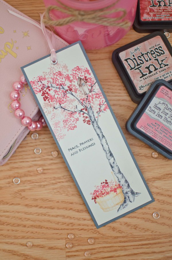
And this is what I came up with!

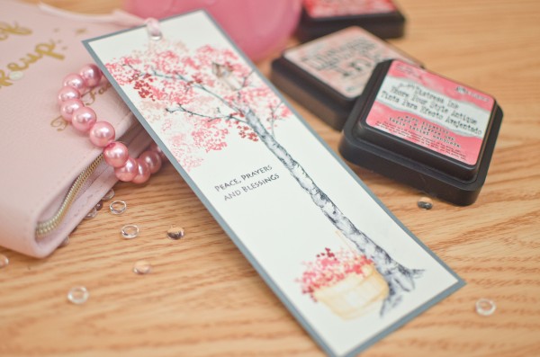
Cherry blossome bookmark (1 of 5)

I started with a long strip of water color paper that I had left over from another project.

For the tree and branches I used Tombow N25. Then taking a waterbrush (a wet watercolor brush will work fine too) I went over some of the inked parts on the tree and branches and started pulling some of the ink towards the centre of the tree to color it in. I made sure not to color the entire tree “grey” so that there are some dark spots and some light spots to add additional dimension. This part may need some practice as pulling too much ink inwards could blur the lines and lose detail in the work.

For the birdhouse I used Tombow 899. Again I used the waterbrush to color in the birdhouse.

The blossoms were stamped using a mix of Distress inks in work lipstick, tattered rose and fired brick. Layering these worked really well just keep in mind that if you’re unsure of where to begin, always start with the lightest color first. You can always stamp over it with a darker color later.

The basket was stamped in Distress Ink dried marigold. Then I stamped the same ink pad on an acrylic block and picked up some of the color with a damp brush and started coloring the basket in, leaving a bright/light spot in the middle to give the basket more dimension.

Finally, I finished the wet media part by stamping a sentiment.

Cherry blossome bookmark (4 of 5)

To finish everything off, I cut the top white space of water color paper off the top and adhered it onto a grey piece of cardstock. Then I added a silver eyelet at the top and strung some strands of pink ribbon through.

To preserve the watercolor and prevent it from fading and smearing, spray it with a light mist of cheap hairspray to seal everything. Learned this trick from my watercolor instructor when I still took art lessons.

Cherry blossome bookmark (3 of 5)

Hope you enjoyed this tutorial, let me know what you think in the comment box below. And let me know if you tried this or if you have any questions about what I did!


Copic marker-colored Christmas cards

It’s been some time since I made a post, almost half a year in fact. My time flies! Life has been eventful in many good ways and I’m looking forward to sharing with you all many of my creations these past few months.

This slideshow requires JavaScript.

But first off, I’d like display some of the Christmas cards I’d made for my friends and family this past Christmas. Copic colouring has become a new hobby of mine and because they’re so pricey, I managed to snag a few cheaper knock off alcohol markers on Aliexpress. I’ll put up a blog post about that soon but from my initial foray into alcohol markers, they seem to work quite well!

I wanted a cute and wintery theme for my cards so I used my Hampton Art Stamp and Die set – Penguins.
SC0714 Stamp & Die Set - Penguins

In order to use this die you need to have a Sizzix or cuttlebug die-cutting machine.

I stamped the image of the penguins using Memento in Tuxedo black by Tsukineko which is one of the best dye inks for alcohol marker coloring. After coloring the penguins, I cut them out using the penguin die.

To decorate the cards I used a few different kinds of backgrounds, here are a few:

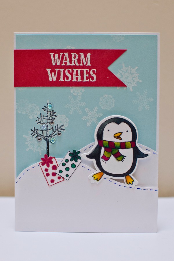
1. staggered snow fields. I used foam dots to create dimension on the snow fields. I used a blue cardstock as the background and stamped white snow flakes .

dsc_0585

2.  A fat ornament on an embossed background. I purposely made the ornament enormous so that it would take up half the card. I cut the ornaments out using my silhouette cameo to the size I wanted. Finally I decorated the ornaments with rhinestones or ribbons.

Finally I used a banner with a white embossed greeting and attached the penguins with a foam dot to make it 3D.

I loved the rhinestone-embellished ornament so much that I made card featuring just the ornament on an embossed background!

Well that’s it I hope you enjoyed these cards and stay tuned for more!


Scary Halloween Invite beckons my ghoulish presence

Halloween invitationMy BFF, Alice, who’s also an avid scrapper, sent me this gorgeous scary invitation to a halloween party. I was so pleased and amazed at the detail and work she put into it that I just had to showcase it here and show everyone else.

She picked up all the supplies from Michaels. Using a stamp with diamonds she made the background of the envelope and then embossed it. The invitation itself was stamped with different colours and then also embossed.

2014-10-26 00.21.10

She even made a few red paint splatters on the front of the envelope to make it look like someone’s blood spilled on it while she was busy working away. Very creepy indeed…I love it!

halloween envelope

Review on silhouette stamping material and Silhouette haul

Silhouette Stamp

Today I wanted to review some of the products in my latest Amazon and Silhouette America haul. I drove all the way down to the states to pick it all up since prices for shipping to Canada is what I personally consider thievery. Taking advantage of the free shipping to the US and 30% off heat transfer material I grabbed a whole bunch of different supplies:

1. transfer material: yellow, glitter black, more white (because it’s so generic and useful) and this lovely teal colour that I’m sure is going to match so well with the yellow and white!

2. Stamping material and the perforated mat

3. Silhouette Fabric blade – which BTW is supposed to be the same as the normal black blade, just a different colour so you don’t get yourself all mixed up. You’re not supposed to cut fabric and paper with the same blade because it dulls the blade that way. That’s also why you never cut paper with your fabric shears.

4. thumb notch punching tool from WeRMemoryKeepers for my project life needs

5. project life photo pocket pages in design G and a WRMK one #50032-3

6. pick me up tool – for rhinestones and very small pieces of paper my chubby fingers are too indelicate to handle.

7. the much raved about pixscan mat which I personally raved about in my earlier blog post.

So the first thing I did with all my brand new loot was create a pretty stamp using the silhouette stamping material.

My BFF requested a stamp to personalize her creations so I created a logo for her using the silhouette studio software which you can take a look at below:

Cut-out stamp mounted on an acrylic block and inked with red pigment ink
Silhouette Stamp

Stamped red on white cardstock with the cut-out stamp below it
Silhouette Stamp

So here are my thoughts on the silhouette stamping material:

Who would benefit the most from creating their own stamps using the silhouette:

In general, I think that anyone who is comfortable using the basic functions of the silhouette studio free software and the usual troubleshooting involved would be able to handle cutting the stamping material.

The individuals who would benefit the most are those who are comfortable using the more advanced functions of Studio, both free and designer versions. For example, if you understand how to weld, cut, trace, then you could make some pretty cool personalized designs.

PROs:

1. Make my own stamps to suit my crafty needs.

I really love the idea of being able to create my own stamps to use with whatever project I want. For example making a personalized logo which I can just stamp on all my projects before I give them away or as a way to promote my brand.

2. Cool and unique stamps can be made even using the free studio software.

I only have the free version of the software and I managed to make that really cool stamp design by welding the words, editing points, cutting and merging where necessary. All of these tools were available to me through the free studio software.

I would love to get the designer version of the software but unfortunately, it’s a little too expensive right now so I’m waiting for a sale.

3. The material inks up and stamps really well!

As you can see above, I get a clear, crisp image which I was not expecting. I thought it would be just a little blotchy or irregularly shaped as the cut isn’t perfect. But upon stamping, it was totally fine and those little areas where the cutting wasn’t as smooth didn’t even show up after stamping on cardstock. I am using Colorbox pigment ink. 

Despite the ink also inking up on the acrylic block, when I stamped, none of the off-target inking transferred to the cardstock which is amazing! Even commercial stamps I get frustrated sometimes because if you press just ever so slightly harder than the sweet spot, you get a big splotchy image. But not with this stamp.

3.  Designs are fairly intricate.
The box instructions do say “Make sure all cut lines are 1/16 inch apart“. I didn’t measure it exactly but as you can probably tell by the ruler in the photograph, the stamp I cut out was about 4 cm in width and 2.5 cm in height. I’ve got some pretty thin lines in this image. I’m not sure if I could get it any thinner than that but I probably could since I’ve seen other people do it. I just haven’t tried yet since this was my first shot.

But not bad for my first shot eh?

4. Fun!

It has been a lot of fun learning how to use the silhouette studio software, the user interface is very much like adobe illustrator (but not as complex) and lots of people actually use it to design commercial products/projects.

It feels very rewarding to come up with a creative idea and then have the tools to make it come to fruition. I thoroughly enjoyed every step from the initial brainstorming and vision to creating my design to actually cutting it out and stamping with it.

CONs:

1. There’s a limit to how small a line you can cut and sometimes for the smaller pieces like holes in the “O’s” etc. the pieces of stamp material get stuck and you have to rip them out. That ripping part created a jagged edge and sometimes causes tears in the stamp itself.

For example, the first time I made this stamp, I made it about 3.5 cm in width and when I ripped out the centre part of the “O” which was stuck pretty firmly, it ripped the top part of the “O”. So it looked more like a “U”.

After some troubleshooting on size of stamp to cut and careful extraction procedures using a combo of nails and exacto knife, my second stamp attempt resulted in an intact “O”.

2. Stamp material flimsy.

So it’s great that the material is soft enough that you can cut it with the silhouette but afterwards it’s flimsy and flexible. Unless you have an acrylic block with grid marks on it, it would be near impossible to have a stamp mounted straight. So I suggest investing in a good acrylic block with grid lines so you can align your stamp to the grid to make it actually stamp the way you want to. I suggest the one offered by Martha Stewart with the little foam pads (as shown above).

If you ever remove your stamp from the block and then put it back on, you won’t get the same stamped image twice unless you cut out a rather chunky and solid stamp. If the material were a little sturdier that would be nice. Not a huge deal if you aren’t a perfectionist.

3. Choice of inks is limited to the pigment variety.

The best type of ink to use with this material is a nice pigment ink. Not even the distress inks will do because it will just bead up on the stamp. Use something like colorbox pigment ink or there is also the generic Michaels brand pigment inks. Tsukineko also makes some good ones as well.

Avoid the archival dye inks because those will just create beads and you’ll get a stamped image of bubbles…unless that was the look you were going for.

Anyone else try other types of inks that worked?

Anyways, tons of possibilities and I’m just starting. Can’t wait to try out my Pixscan mat so stay tuned for that!

vintage christmas card

My tutorial on how to make a vintage style Christmas card!

Vintage Christmas Card-1 Vintage Christmas Card-1-2 Vintage Christmas Card-2

The 3 photos above show the one that I created last year and sent to one of my friends but since this was such an awesome and lovely card, I wanted to make a bunch more this year too and give them away to other friends as well. It works quite well if you’re looking for a Christmas card to give to one of you guy friends because it’s not too girly haha!

This card has a postcard theme and I specifically bought this stamp from Michaels because I love the look of postcards. For this tutorial, it will take some time to complete but the steps are easy and the final product is beautiful!

I’ve added an extra layer of vintaging to the tutorial by making a crackle effect! I think it looks soooo lovely with the extra details. Whoever receives this card is going to feel truly blessed this Christmas season by all the work you put into this card.

The supplies you’ll need:

Supplies 1

1. One 5 1/4 x 3 3/4 inch manilla/cream cardstock

2. On 4 x 5 1/2 inch cream card and envelope (I’m using the Recollections brand of card/envelope)
3. Red and Green Stickles or other glitter glue
4. Fast-drying Tacky Glue (Scotch)
5. ATG gun/tape runner
6. foam dots

Vintage Christmas Card-2-2

7. Archival black ink (StazOn Jet Black)
8. Distress Ink – Vintage Photo and Walnut Stain with foam daubers
9. Red stamp pad – colorbox in red

Vintage Christmas Card-3

10. Silver “Merry Christmas” stickers
11. Postcard Stamp – Stampendous Snow Postcard
12. Tim Holtz  French Market Acrylic stamp set – postage stamp piece
13. Acrylic Block – Martha Stewart (the one with foam feet)
14. Ranger Crackle Paint in Rock Candy

Vintage Christmas Card-4

Instructions:

1. Place your inset cardstock piece on a craft mat and tack it down with washi tape to avoid dislodging it when stamping.

2. Ink up the postcard stamp with black archival ink and line up the stamp using the guides of the craft mat.

Vintage Christmas Card-5

3. Using Scissors or a paper distressing tool, distress the edges of the cardstock.

Vintage Christmas Card-6

4. Ink up the foam dauber with Vintage Photo and rub around the edges of the cardstock being careful not to distress the centre of the image too much. I think I may have overdone the centre a bit but you won’t make that mistake! Then ink up a foam dauber with Walnut Stain and distress the edges of the cardstock to make the image pop.
Vintage Christmas Card-95. Using Rock Candy Crackle Paint and generously layer the cardstock with a layer of the paint. Be careful as some of the vintage photo distress ink will transfer to your paint brush, but only a little bit. Let it dry for about 30 minutes. If you’d like to speed up the drying time, once it’s started to dry and you can clearly see crackles, the bottle says you can use a heat tool to speed it up. Just don’t use your heat tool right off the bat, then you won’t get any crackling. I just let it dry by itself and work on other parts of the project in the meantime. After the crackle paint has COMPLETELY dried (very important this!) put a big text book or dictionary over top of it and let it flatten out since the wet medium has made it crinkle and warp. Let that sit at least an hour to overnight.

Vintage Christmas Card-13

6. Ink up the French Market postage stamp acrylic stamp piece with your red stamp pad of choice. I’m using a red colorbox pigment ink. Don’t use distress inks here as the fine details of the stamp will become blurred by the wetness of the distress ink. Then stamp it on some scrap cream cardstock and cut around the edges leaving just a little bit of a border.

Vintage Christmas Card-107. Use foam dots to attach your red stamp to your now dried piece of cardstock with the stamped postcard and crackled image right over the stamp portion of the postcard image. I found that my foam dots didn’t attach so well the distressed crackle paint so I added a few extra dots of tacky glue to really make a good stick. Vintage Christmas Card-16

8. Use red Stickles to make holly berries over the stamped postcard image and use the green stickles to fill in the holly leaves. Let dry at least 45 minutes to 1 hour. You can see that my cardstock even sitting under a heavy physics textbook, is still a little warped. Once we glue it to our card, it’ll flatten out.

Vintage Christmas Card-17

9. Finally, using your tape runner, adhere your cardstock piece to the card. Since we used the wet crackle paint medium on the cardstock, it’ll be a bit wrinkly and won’t lie flat. Mine had edges that came up after sticking it down to the card with my ATG gun. So I used my tacky glue around the raised edges and pressed for a few seconds and wiped away the excess glue with my finger.

Vintage Christmas Card-21

And tada~ the final project all done!Vintage Christmas Card-1-4

I’d love to hear your comments and suggestions to make this card even better and help out others looking for more efficient techniques!

And please share your vintage style Christmas cards too!